What do you get when you cross a style guide with a mood board?
That might sound like the set up for a bad marketing joke that only branding geeks would find funny, but it’s actually an apt description for a brand board.
A brand board is a brief one or two-page document that contains all of a company’s, products, or service’s branding elements, organized for quick reference. It’s like a style guide-lite, with most of the style elements removed.
It’s intended as a quick reference for use whenever a piece of marketing collateral is created to be certain that all the basic brand elements are present. It helps keep all of your various communications consistent in look and feel.
“But I Already Have a Style Guide. Why Do I Need a Brand Board?”
Well, do you have a website and also business cards? How about sales brochures as well as a simple one-sheeter?
Each of these has its purpose. Your website might describe your company in detail while your business card gives a quick, portable snapshot. Your ten-page sales brochure provides your customers with all of the information that could possibly want to know about your product while your one-sheeter quickly captures the essence of what’s important.
Brand boards are important because, like the examples above, they’re a lightweight, portable, easy-to-digest version of your style guide.
Style guides capture the entirety of a brand’s usage guidelines, drilling down into design minutia like the proper padding for a logo and the correct relative font sizes. This is all very important but is usually much too lengthy to function as a quick reference. And it’s often more information than a designer needs.
A brand board distills the most critical elements of your brand into a single reference point. It complements your style guide if you have one and if you don’t you absolutely need a brand board. Otherwise, you have nothing to keep your brand messaging consistent.
“Your Brief but Compelling Argument Has Convinced Me. What Should Go into My Brand Board?”
Besides its brevity, a brand board is different from a style guide in that it doesn’t include rules or guidelines. It simply presents all the necessary brand elements in a clear, visual way. You should include:
- Main logo: Your main logo mark should be featured prominently.
- Secondary logos: If you have different versions of your logo for different purposes, you should include those, as well as any other submarkets, like taglines.
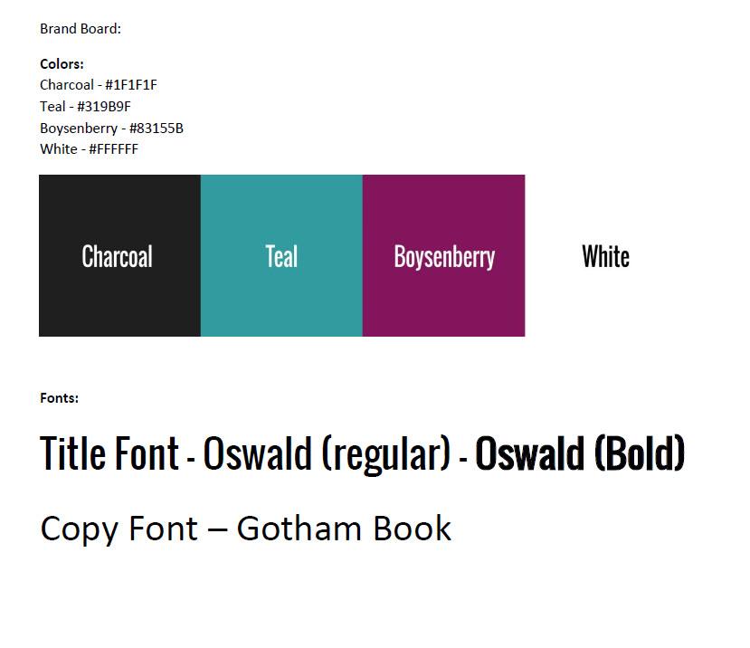
- Typography: Include the names of the fonts used by your brand as well as visual samples. If they’re used for specific purposes, like headlines or copy text you can mention that, but you don’t need to list any other usage rules.
- Color Palette: Add swatches of your brand colors. It can be helpful to list the hex values along with a sample of the color.
- Iconography: If there are other common graphical elements used by your brand, add them for visual reference.
- Inspiration imagery: This isn’t always applicable, but sometimes it’s helpful to include examples of the sorts of imagery that should be featured when talking about your brand. As an example, if you sell a lifestyle product you could feature stock images that would appeal to your target market.
Here’s what the SDDM brand board looks like:

Once you have a brand board in hand, distribute it each and every time you have a new designer creating collateral for you. This simple document is a powerful way to guarantee a consistent look and feel to your marketing efforts.
If you’re interested in a brand board but don’t have the digital skills required to build one, or if you’re interested in more robust branding work, contact us today. We have the skills to realize your brand vision. We also have a bunch of really bad marketing jokes that we will keep to ourselves. You’re welcome.


